Yorba - Boba Ordering App
Creating a sleek UI to order tea

My Role
I created this app to learn more about Google's framework Flutter and see if I could improve people's experience with ordering from a tea shop. I also wanted to improve my UI design skills and understand what makes an app a delight to use.
Tools: Flutter, Dart
Skills: Front-End Development, UI Design
Background
One of the most popular boba tea shops (and my favorite) in San Diego, CA, is Camellia Rd. They are known for their silky smooth honey boba and refind milk tea drinks. Moreover, they are especially keen on their matcha drinks, using a different kind of matcha powder every day, imported from different prefectures in Japan.
Problem
One of the main problems with Camellia Rd is that their tea menu is hard to gloss over. Moreover, due to the shop's popularity, the lines are often long.
Solution
I created a boba tea app specifically for Camellia Rd to make ordering easier and speed up the order process. I did this by reading about making a delightful UI interface and providing an SKU order at the end of each order in the app to show the cashier what tea you wanted.
Implementation
UI Research
Camellia Rd's menu is quite bland; it is just a laminated paper with the drink names and a minor description. I knew I had to start with this problem first. I wanted to bring life to the menu, a way to indicate what a particular drink looks like and what its toppings indicate.
I had little experience with UI design, so I spent the next few weeks reading UI Design articles, everything from color choice to what shapes indicate a user. I decided to use vibrant colors to show the color of a tea, but still stay true to what it looks like in real life:
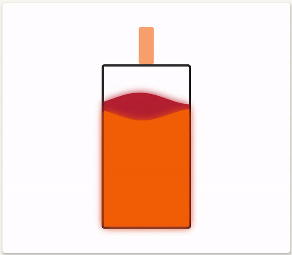
Thai tea drink in motion
Structure
After translating all the menu items to the app I had a first good ordering app. The main issue was:
-
How to position the UI elements?
-
How to teach the user to order through the app?
Position
I kept tinkering with the UI elements' position, but after each iteration, I noticed it would look somewhat awkward, or there was this feeling of it being "off." I decided to read more on UI design, more specifically, what makes objects look pleasant or beautiful? That is when I stumbled upon the idea of the Golden Ratio. A mathematical ratio found in nature and human-made objects that biologically pleases the eye. I decided to experiment with this idea and transfer this idea to my app:

Examples of the Golden Ratio in nature and buildings
After applying the golden ratio to my app and tweaking the UI a bit, I was instantly delighted with how it turned out and the users I tested the app with were pleased as well:

Yorba using the Golden Ratio
Tutorial
When first testing out with users, most of them did not know how to order with the app, which was a major issue. I needed a way to convey to them how to pick out items and how to start over. I researched different methods of conveying action to a user and decided to do something most people are familiar with, following steps and color cues:


Checkout
Once a user decides on their order, I wanted to let the cashier know quickly about what a user wanted. I did not want to focus on doing an online order because the shop was also a social hub, and there was a sense of delight when going out with a friend to visit a boba shop. Therefore, I resorted to a barcode system, where each combination of a drink would be a unique SKU code that the cashier's POS could scan to make the order:

Example of the checkout page
What I Learned
The whole process of designing an app focusing on UX and UI was a pleasant and challenging ride. Iterating through different mockups and reading more about what makes a product a delight to use was definitely an interesting and rewarding experience. This project has helped me better understand that user research is important, but more importantly, users need to want to like using your product. A user can like my app, but for me, I want a user to love it.


